
Sheesham pieces on walnut board contrast
Sort:

Nov 20, 2018
0
#4
I think the best thing to do is send me the board and order a new one for yourself with different woods;)
I like the set in general, maybe the board should be something clearer and increase the contrast of the black pieces.
Nov 21, 2018
0
#6
I think first of all you should set that board with those pieces somewhere else more secure, it looks like it might fall down ![]()
Nov 21, 2018
0
#7
Nice pieces, and nice board. Don't think one more second about it. Trying to change either one would be a big mistake, and buying new stuff would be a waste of money. There is no issue with the contrast.
I understand obsessing over a small detail like that. I do it all the time. But you shouldn't.
Nov 21, 2018
0
#8
kaspariano wrote:
I think first of all you should set that board with those pieces somewhere else more secure, it looks like it might fall down
I was thrown off a bit too but it's a glass table...lol
Back on OT there is nothing inherently wrong with that very nice set and board. It's a matter of personal preference. Only thing is I would really recommend against trying to alter either one.
Nov 21, 2018
0
#9
This topic is of particular interest to me because I have the exact same board, and I'm thinking of getting a "golden rosewood" AKA sheesam dubrovnik set from HoS. I agree with what others have said that you shouldn't obsess over it. But at the same time, it gives me pause before making an initial purchase of my pieces...
Nov 21, 2018
0
#10
HOS has come out with a new version of Dubrovnik with Gilded chess pieces, looks very suitable for a walnut/maple board.
https://www.houseofstaunton.com/the-dubrovnik-series-gilded-chess-pieces-3-75-king.html
TheJackalC4 wrote:
Only thing is I would really recommend against trying to alter either one.
Absolutely, that would only be likely to ruin them.
If one can get Dubrovnik, or another style one likes, of pieces in white and black for that board, that would be fine, but there is no rush. And later one could get a second board that goes better with the old pieces which are good as well.
Guys, thank you for all the replies.
I am definitely keeping both pieces and board.
I figured that the more light there is, the more apparent the contrast bacomes. Here are couple of pictures of the combination with better lighting:


And for the poor lighting condition I also got a Reykjavik Set in ebonized boxwood:

FluxBlunders wrote:
This topic is of particular interest to me because I have the exact same board, and I'm thinking of getting a "golden rosewood" AKA sheesam dubrovnik set from HoS. I agree with what others have said that you shouldn't obsess over it. But at the same time, it gives me pause before making an initial purchase of my pieces...
My friend, specifically for your case, I would like to share my experience with this board. This particular board is a bit on a dark side of walnut. And it also has some prominent grain pattern. By itself it is awesome and very beautiful, but it gets complicated with sheesham sets. I had three sheesham sets before that were a bit too close in color, so there were not enough contrast by any means. This Zagreb set that you see in pictures is the darkest sheesham set I could find out there.
And it seems to be working with this board when lighting is good. 😃
so, I would try to make sure I am getting as dark of a sheesham set as I possibly can before putting an order.
Good luck my friend!
P.s.: Dark sheesham is much more beautiful than rosewood in my humble opinion. 🙂
Nov 24, 2018
0
#16
Geniemir wrote:
so, I would try to make sure I am getting as dark of a sheesham set as I possibly can before putting an order.
I was thinking this also. But as with buying many things online, it can be tricky to get an idea of exactly what it'll look like in person as compared to the pictures online. As you just showed, the lighting can make a big difference. With these wooden chess pieces there's another complication added in that there's going to be some natural variation. Two different sets made from the exact species of wood can vary in appearance slightly because they were made from different trees.
HoS has the added problem that they're using the term "golden rosewood" which is just a marketing term for a type of tree that doesn't exist. So they can use it as a catch all term for dark pieces that come from different types of trees and mostly look the same. To illustrate, here's a search page from The Chess Store for sets with "golden rosewood" pieces on walnut boards. There's a difference in color of the golden rosewood pieces you can see between some of the sets, and some of them are dramatic. But maybe it's just the lighting of the pictures? The set that I wanted for example, Dubrovnik 2 from HoS, looks way different from different pictures. The golden rosewood pieces HoS show on their site are way lighter than pictures I've seen posted by people who actually bought them. That includes you too actually, with the pictures you posted in the Dubrovnik HoS VS Bazaar thread. How dark are those sheesham pieces VS the pieces from this zagreb set? Have you ever had the same contrast concerns with that set and this board?
For me, I made my purchase last night and decided to spring for the tasmanian blackwood dubrovnik pieces. Someone else said that for what they cost you may as well pay a bit more and spring for the NOJ pieces, which is a fair point. But I got them 20% off with the black Friday sale - $320. At that price, it's about half of what I'd pay for the NOJ pieces when you factor in shipping and customs. I think it was worth it. I'll post some pictures to that other thread when I get them.
Sheesham (golden rosewood) pieces on a lighter Drueke walnut board.
You made a good choice. I ended up returning golden rosewood hos Dubrovnik for this exact reason. The wood tone was way different from what I expected. In fast you are right, it was some totally different wood species, because wood was more like striped grey and blackish zebra with no hint of brown tone. On camera it looked ok and the contrast was alright since pieces looked more grey than the brown squares, but the set looked pale for my taste. The Zagreb set I kept is dark rich brown tone. 🙂
So, yes, Tasmanian should be way more sexy.
loubalch wrote:
Sheesham (golden rosewood) pieces on a lighter Drueke walnut board.
That looks nice. Your board is much lighter. Nice. A little easier with sheesham pieces contrasts. 🙂
Nov 24, 2018
0
#20
Geniemir wrote:
Guys, thank you for all the replies.
I am definitely keeping both pieces and board.
I figured that the more light there is, the more apparent the contrast bacomes. Here are couple of pictures of the combination with better lighting:
Looks perfect. When you buy new things you focus on insignificant little stuff, then over time you forget about it.
I fixed some drywall after a pipe leaked and when I was done, it bugged me that I didn't match the texture perfectly.
2 years later, a new leak in the same spot. I had to cut into the same spot on the wall and noticed the texture difference. In the last 2 years the texture was completely unnoticed by me, even though it is in a very noticeable place on the wall in the living room.
Moral: you stop thinking about it. Enjoy your set!
Also: there are no rules about contrast. Some people might even prefer board square color to identically match the piece colors.
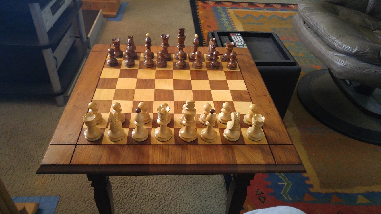
Hello fellow chess addicts!
I have a sheesham Zagreb pieces and Drueke style walnut board.
What is your opinion on the combination contrast? It seems to me that a bit more contrast would be better for this combo. And thus, Can someone suggest a way to increase the contrast? Meaning, is there a way to darken pieces or brighten the board that you can suggest?
Regards