That looks amazing.
could we have closer looks at the other piecse
That looks amazing.
could we have closer looks at the other piecse
That set looks really nice! The knights are super smooth and stylish.
A few changes I'd like to see:
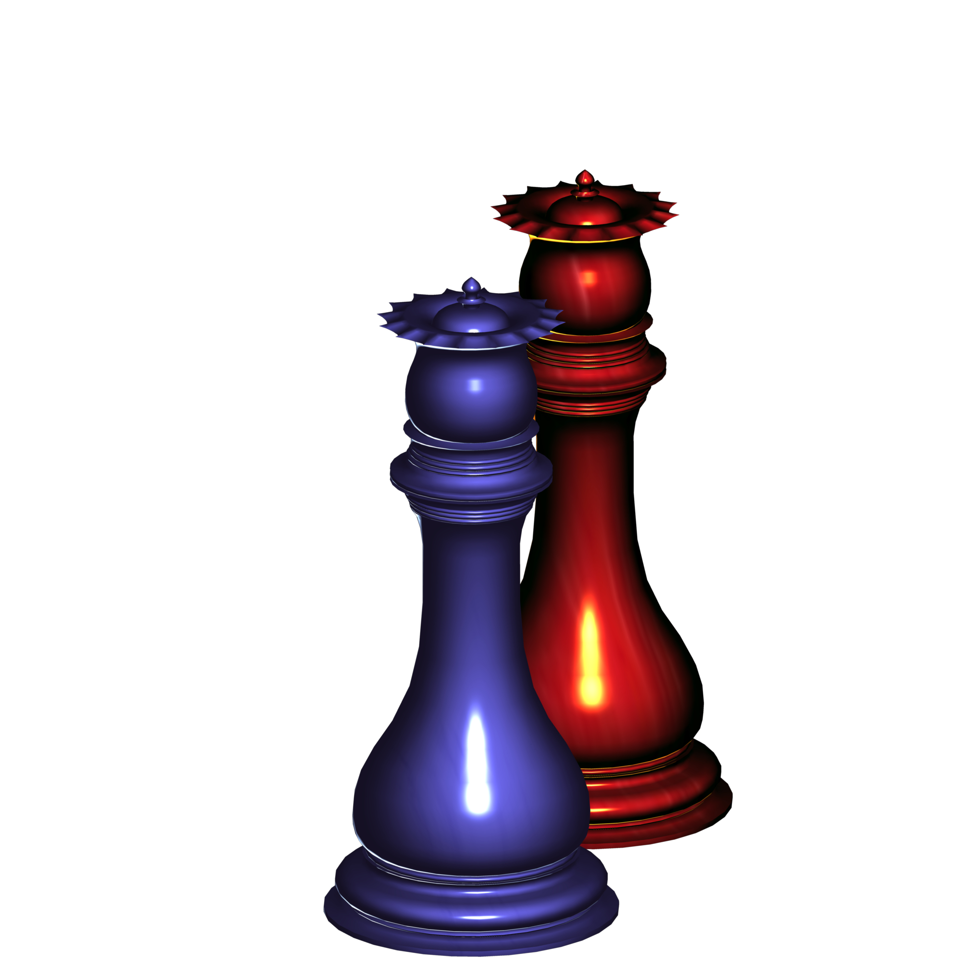
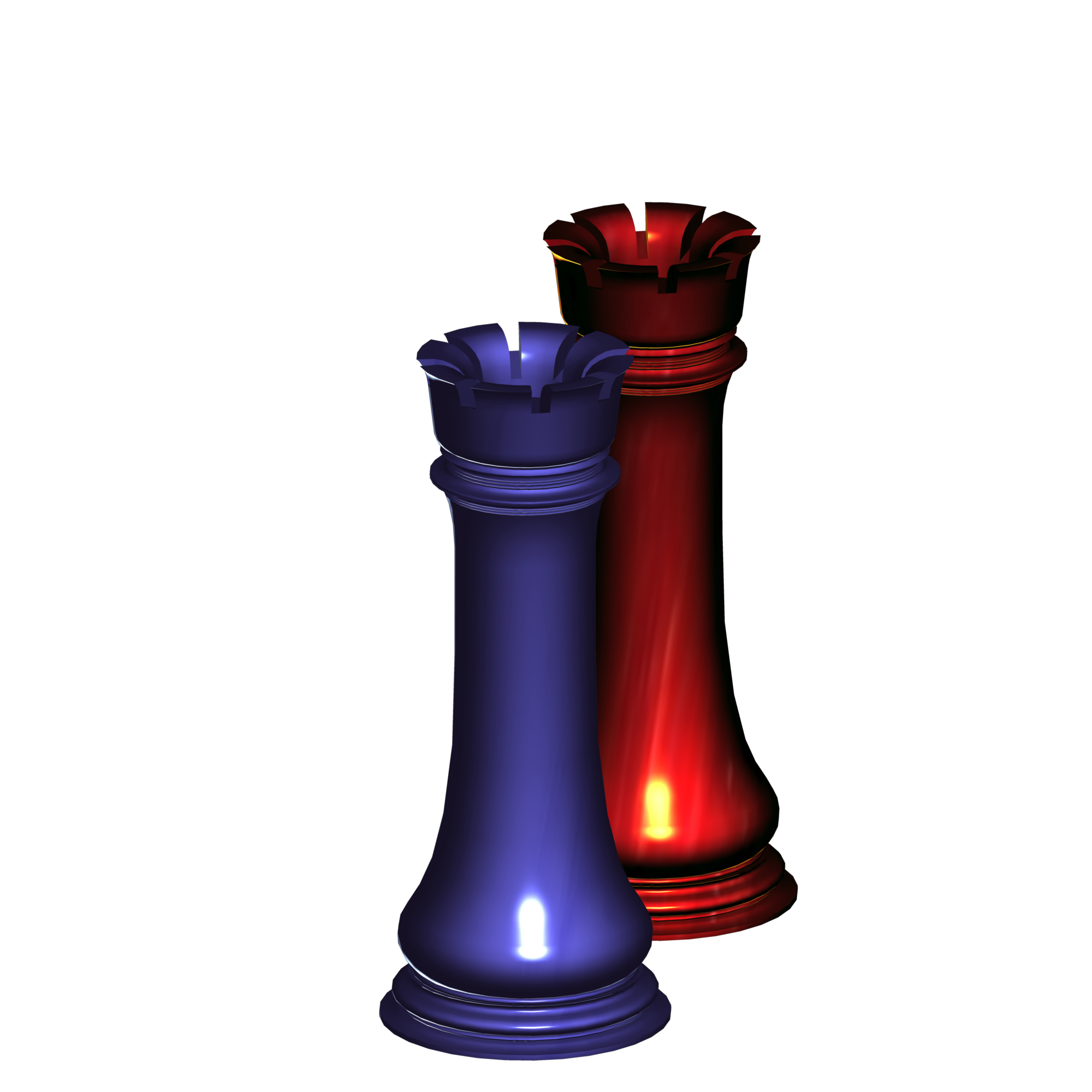
The rooks are too tall, need to be shorter. (Just my preference - I like short and squat rooks.)
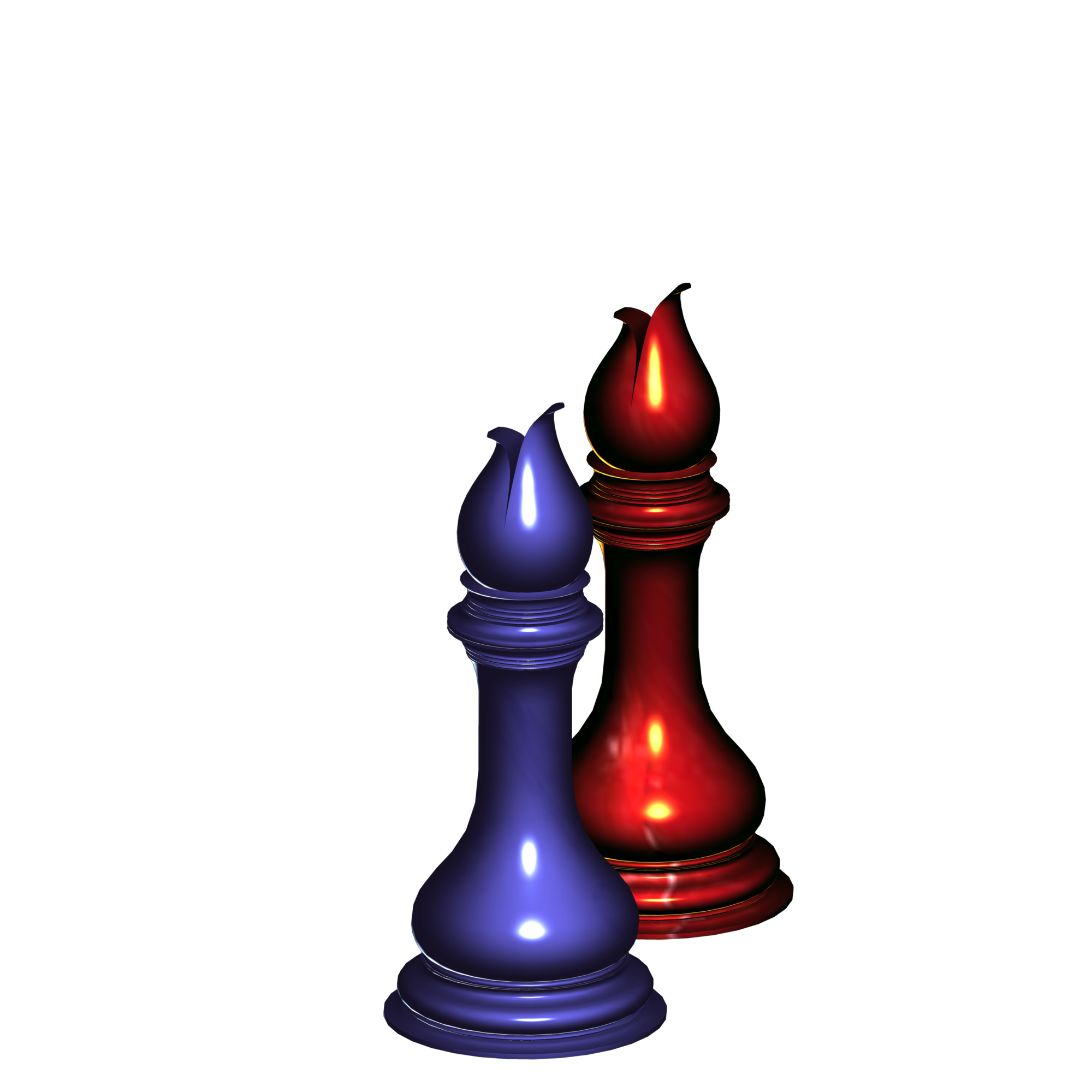
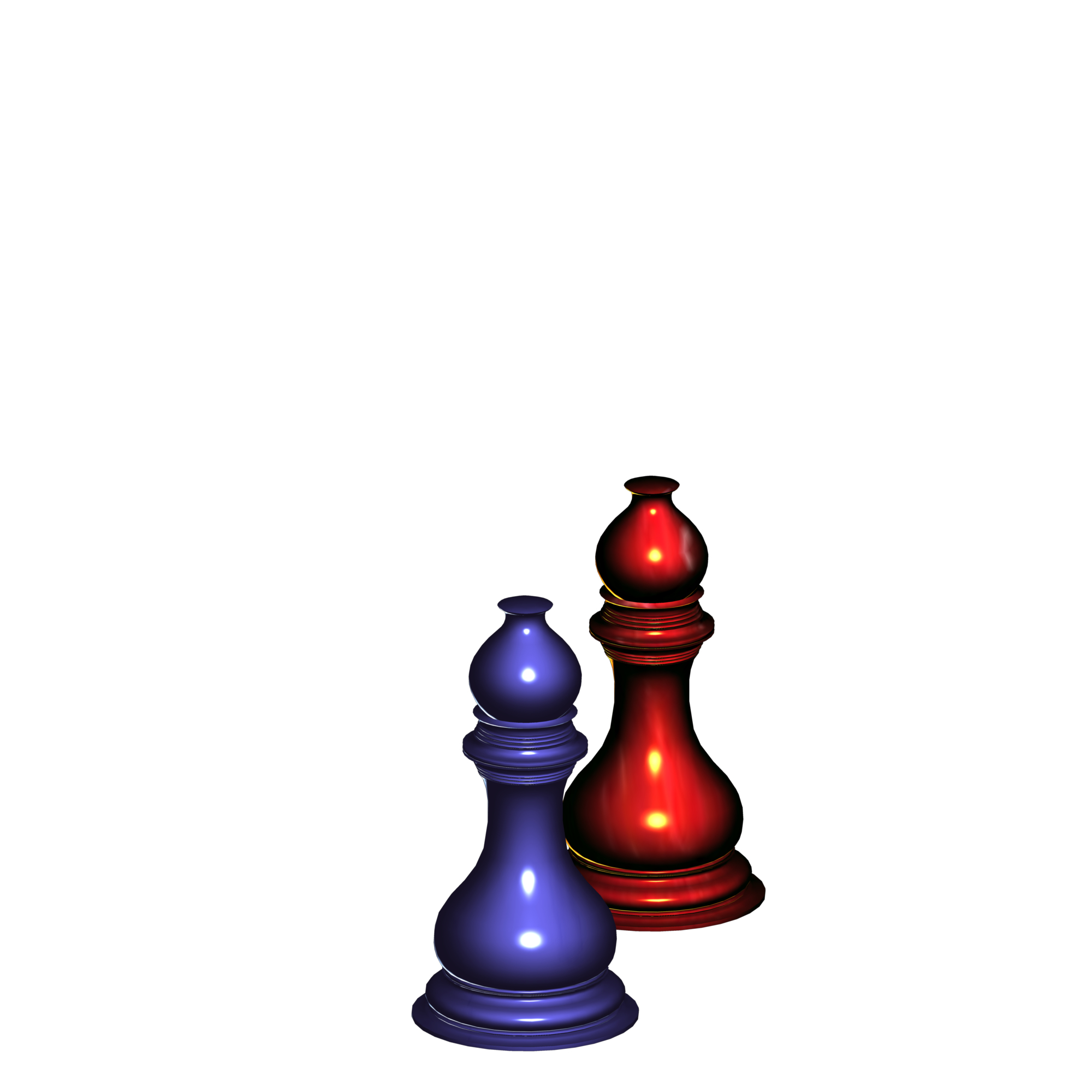
Bishops maybe a smidgen taller (but still smaller than the queen)?
Maybe beef up the king's finial a smidgen?
But the set looks cool...
Well, thank you, my good man.
I actually notated this in my advertisement where the 3D set model is being sold: All my chess sets will have Rooks that are very tall; taller than the Staunton standard that one may be used to. Thankfully, the shaft I created is designed for anyone to shorten the Rook to be slightly shorter or equal to that of the Knight, if they don't like the unique height in this set.
As far as the other things, are you saying the Bishop is a little too tall? Also, what exactly should I do to "beef up" the King's Fleur de Lis finial? ![]()
Thank you for the encouragement.
Well, thank you, my good man.
I actually notated this in my advertisement where the 3D set model is being sold: All my chess sets will have Rooks that are very tall; taller than the Staunton standard that one may be used to. Thankfully, the shaft I created is designed for anyone to shorten the Rook to be slightly shorter or equal to that of the Knight, if they don't like the unique height in this set.
As far as the other things, are you saying the Bishop is a little too tall? Also, what exactly should I do to "beef up" the King's Fleur de Lis finial?
Thank you for the encouragement.
No, I'm saying make the bishop a wee bit taller.
The king's finial? Idk, it just seemed a bit dainty. :-)
Oh, and pardon my ignorance and confusion - These are digital models? Are the models sold to programmers who will be creating chess programs?
These are digital models? Are the models sold to programmers who will be creating chess programs?
Potentially. I would think that is the best target audience.
As far the King's finnial, should I make it fatter? lol
They look sad? ![]()
![]()
They were modeled from these front and side reference images.


lol
But, different eyes do see different things. Without prior information, one could interpret the Knight's facial expressions vastly differently from the next person.
A little idea, I don't paticularly like the bishop's curve on the top, maybe would personally feel better if it was higher and not so curved; a tiny little bit would suffice;
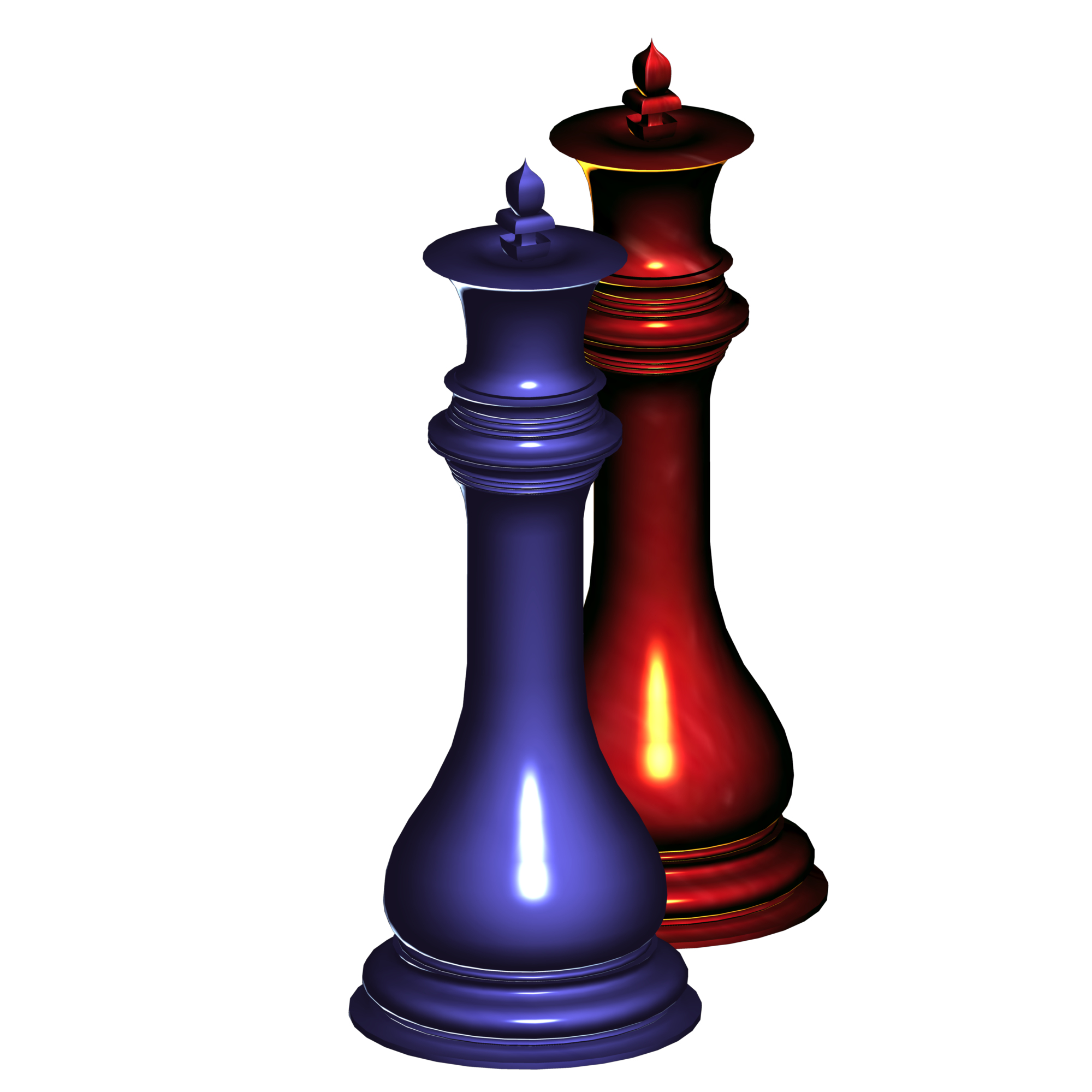
The crown of the queen looks too flat, too 2D. The crown is a 3D object and now it's like cut paper. Could you make the queen look a little nicer?
It's the same with the king. the crown of the king looks like it's flat as well;
Could you boost up the height of the king as well? I feel like the top cross is too short; maybe the top cross could be a little higher, the crown a little 3D-er and the main body a little shorter to balance it out?
Thanks
In other words, you don't like this set? ![]()
It's quite alright if you don't. If that's how you feel, then that's how you feel.
In other words, you don't like this set?
It's quite alright if you don't. If that's how you feel, then that's how you feel.
In other words, I think the thing about this exquisite set is that it is too exquisite;
and about the flatness, I suppose it's a graphical problem? It's impossible to make the crown that flat in real life.
My suggestions:
1) Make the crowns look less flat
2) Taller king cross, shorter body to counterbalance the taller king cross
3) The bishop's curve is too exquisite and may be hard to make practically.
Overall I like this set for obvious reasons, but only suggestions are useful...I guess?
Great! I think you can decrease the brightness for the pieces, because high brightness can be affecting the eyes.
In other words, you don't like this set?
It's quite alright if you don't. If that's how you feel, then that's how you feel.
In other words, I think the thing about this exquisite set is that it is too exquisite;
and about the flatness, I suppose it's a graphical problem? It's impossible to make the crown that flat in real life.
My suggestions:
1) Make the crowns look less flat
2) Taller king cross, shorter body to counterbalance the taller king cross
3) The bishop's curve is too exquisite and may be hard to make practically.
When you say "flat", do you mean that the thickness of the finial (crown) pieces is too thin? If so, you're right: that's simply a graphical technicality. (Should this set be a design in real life, and it very well may be, they definitely wouldn't be thin like that.)
edit - I just realized, I think @EscherehcsE might be saying the same thing you are regarding the King's finial (crown) component; he referred to it as being "too dainty". If in fact you two mean the same thing expressed with different terminologies, then well, that's 2 people making the same suggestion.
As far as the King's height and the size of his finial, I'm keeping the "small crown" standard for this set. The pieces have been measured so that their height produces a visual curve. The crown sizes are supposed to produce an even steeper visual curve.
Overall I like this set for obvious reasons, but only suggestions are useful...I guess?
I appreciate your suggestions. We may not agree completely, but your feedback did make me assess my design, all the same. ![]()
that looks great! i really like the queen
I just upvoted them back hahaha
Cancelled out anything unwanted
And yeah, I appreciate your feedback. That was indeed what I was referring to. Thanks
Hello,
I'd like for all to observe the following. It is my latest chess design, Deserted Empress Luxury Chess set.
The Knight piece I especially took great time to produce it to high quality. Took 3 weeks to perfect.
What do you think? Your feedback would be nice.