I don't know about plastic, LoveMagnet. It still has a connotation of cheap. Your design would cost a fortune to be carved out of wood because of its intricacy so that's probably out. You might want to take a look at the Studio Ann Carlton chess sets. They're made of a resin/stone dust mixture. The epoxy makes them very durable (and can be tinted) and the stone dust gives them weight and a certain character. Done well, the result can fool the casual observer into thinking that they're carved of stone. I do question how well your set would stand up to any kind of regular use though. The points on the K and Q look delicate as do the ears of the knights. Anyway you've had about 25 cents worth of my 2 cents today, so I'll stop... 
Should I put my chess set into production?
Sort:
Baddogno, you almost got them all. I also made the base of the rook smaller, allowing the tower to be taller, and I gave the tower an ever so slight inward curve, to counter the "lego" look. The turret also got a little bit of a curve.
The king may be the piece that I have spent the least amount of time on so far, and I think that almost every part of it needs some modification, not least the crown. However I would hope that I don't HAVE to put a cross on the top, because he already has a cross on the globus cruciger, and I think it will be a bit much if there are two crosses on the same piece.
You may be right that the knight should be a bit chunkier. However it is not as easy as just scaling it up a bit. If I make the nose wider for example, it very quickly gets a bovine look to it, which is NOT what I want. But I think that with some more work and time I can get it right.
Great set..love the pawns.Perhaps a more distinctive crown for the king and maybe thicker rooks.
I wouldn't.
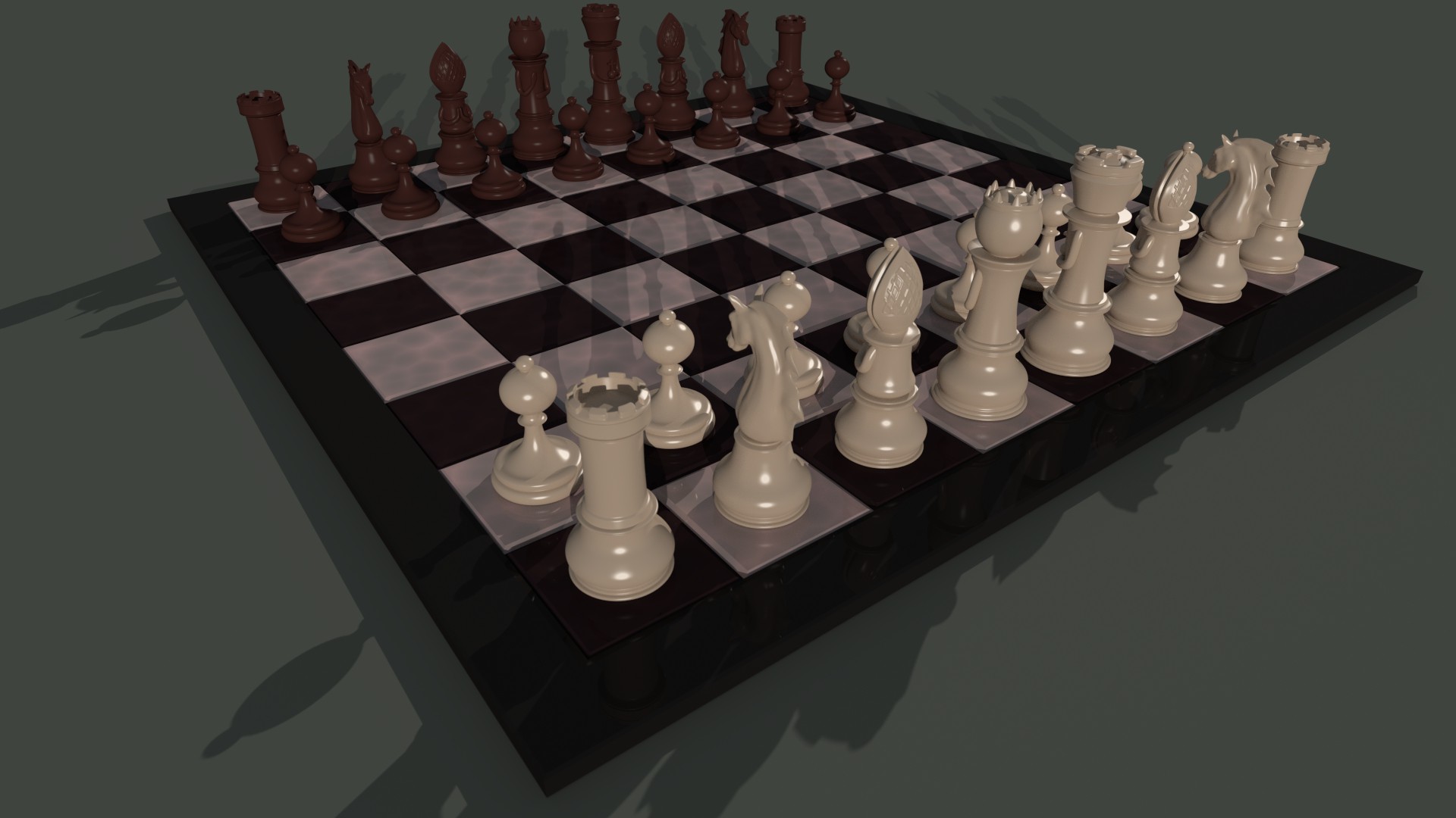
Staunton-pattern is best and if going to deviate from that then display/ornate/decorative sets are better which people then choose to leave on pernament view in their homes.
I would tell you to follow your dream. Then I realized the king and queen are just asking to be used as weapons and this could turn into a nightmare.
:) jk jk
LoveMagnet wrote:
Recently I have been modeling a chess set as an exercise in 3D modelling. At first I just made a knight piece, but then I got so engrossed with the process that I went on to make a complete set.
It is a very pretty set and I like it a lot. My only feedback would be to distinguish the King from the Queen a bit more.
That's some very impressive work, you obviously have the artistic talent required. Chess sets & boards are a very important part of the game & there are some very good reasons why the Staunton pattern is used so widely & why certain board colors are the preferred options so my 1st question is what is your intended market? If you want to crack into the general playing & competition market there are a few things to consider.
1/- No matter how aesthetically pleasing your set is, how does it look after staring at it for 2 hours under neon lights while wracking you brain over how to salvage a draw in a highly complex position.
2/- To a competition player once the game starts all they care about is the game so the pieces must be be easy to recognize & not distracting. Everyone likes a nice board & pieces but looking at then from an aesthetic point of view & actually playing with them are 2 very different things. The trick is to be able to combine both. I think you are very close to doing that.
Why not take it to your local Chess club & let them evaluate it under actual playing conditions.
I would also try some variations on color. Too stark a contrast between black & white will be hard on the eyes under competition conditions. I also agree with the other comments about the King & Queen being a bit similar but that should be an easy fix, the traditional cross on the King should do it.
I can't go much further based purely on pics, it may need some minor tweaks on ratio of sizes etc & the choice of board will have an effect too. You will need to match standard competition size & unless you supply your own board with the set it will need to be compatible with standard boards currently in use.
It's certainly the best design I have seen that offers an alternative to the Staunton pattern.
QueenTakesKnightOOPS wrote:
That's some very impressive work, you obviously have the artistic talent required. Chess sets & boards are a very important part of the game & there are some very good reasons why the Staunton pattern is used so widely & why certain board colors are the preferred options so my 1st question is what is your intended market? If you want to crack into the general playing & competition market there are a few things to consider.
1/- No matter how aesthetically pleasing your set is, how does it look after staring at it for 2 hours under neon lights while wracking you brain over how to salvage a draw in a highly complex position.
2/- To a competition player once the game starts all they care about is the game so the pieces must be be easy to recognize & not distracting. Everyone likes a nice board & pieces but looking at then from an aesthetic point of view & actually playing with them are 2 very different things. The trick is to be able to combine both. I think you are very close to doing that.
Why not take it to your local Chess club & let them evaluate it under actual playing conditions.
I would also try some variations on color. Too stark a contrast between black & white will be hard on the eyes under competition conditions. I also agree with the other comments about the King & Queen being a bit similar but that should be an easy fix, the traditional cross on the King should do it.
I can't go much further based purely on pics, it may need some minor tweaks on ratio of sizes etc & the choice of board will have an effect too. You will need to match standard competition size & unless you supply your own board with the set it will need to be compatible with standard boards currently in use.
It's certainly the best design I have seen that offers an alternative to the Staunton pattern.
wow u wrote all that?
Beautiful.
But as mentioned by others, the King and Queen look too much alike and the Knights need to be thicker.
Really great work! I too have been disappointed with chess sets available to purchase so i designed my own, and i too am having trouble with production.
But i disagree with your theory of sharing, i will copyright my idea before i share it on a public forum like this, i believe strongly in the quality of my design (and you should too) and copyrighting is cheap enough so there is no reason not to.
I can share a couple of tips though
I sculpted mine out of Cx5 wax... http://youtu.be/8zYkiEOrnKs and a neat trick for weighting is you can use what they call "elevator bolts" from the hardware store and sculpt around them! http://www.lowes.com/Fasteners/Bolts/Elevator-Bolts/_/N-1z0yk5s/pl#! They are used to level things like fridges and dryers :) and come in the perfect variations of sizes for chess pieces with standard weight and diameter.
Now from what i understand http://www.tapplastics.com/ has about 5 differnt ways you can cheaply create a mold for anything you sculpt, and then you can use dental stone, resign or various plastics to pour in to create pieces.
Please keep me posted as you progress, i am routing for you and if you get it all figured out please let me know, my set would not be competing against yours because it violates all of the well thought out suggestions QueenTakesKnightOOPS mentioned. Mine would definetely not be for competetion use but i think would be highly saught after by collectors and enthusiests alike.
I would love to own one of your sets... cant afford it right now but i appreciate your approach, mine was the same, I wanted to make one i would want and was unsatisfied with what was available to purchase
I like the set a lot, the King's cross I agree with and the comment about the Knight. I think they's sell well.
Worked a bit more on the king. Fixed the overall shape, so that the curve of the body flows into the curve of the head/helmet/whatever. Made the diameter of the crown bigger and replaced the spikes with a design that is less prone to breakage (although there is evidence to suggest that a crown of this type CAN break after all), and added a big cross (well, more of a plus sign really) at the top.


Another game of "spot the difference". Hint: It's in the middle of the picture.

Sep 8, 2013
0
#36
In my personal opinion the Bishops and the Rooks are some of the very nicest I have seen. Great work!  The Knight is looking much better than it did in the original pictures as well. I hope you can find interested parties. It would be a beautiful set to own.
Played around with colors, textures and lights. Still very unhappy with the king, but hey... If it was easy it wouldn't be worth doing.
Sep 8, 2013
0
#38
Congratulations ! Very nice. One comment about the queen: maybe queen's face could be more abstract. Perhaps removing the facial circle might work better?
It's not my kind of set (i like a very essential design for chess pieces), but that doesn't stop me from noticing that it's actually a very nice set.
I agree with you on the fact that the king is the weakest part of the design right now, it's not bad in itself but just doesn't look like it's part of the same set (very massive compared to the other pieces, which are ligth and elegant). It also doesn't look particularly like a king (i fear that after one century of staunton design you really can't call it a king anymore without the classical cross on the top).
The knight is also still a bit unconvincing to me, for the opposite reason. It's very thin and frail looking; it just looks like a weak piece. The design is ok but it has to get much "fatter" imho. This is important since the knight is the piece with the most flexible design in a staunton style set (while rooks, for example, are more or less always the same), so it's the very first piece everybody will look at when judging the whole set.
Also, in case you don't know, you're designing an english-speaking board by making the bishop look like a "bishop". In Italy the bishop is actually the "standard-bearer", in France it's the "fool", in Germany it's a "runner". This is not an issue of course, but i just wanted to make sure that you know why not everywhere people will understand why your bishop looks like...a bishop :P
I basically designed a set that I would want to own myself. Something that looks good enough to leave out for decorative purposes (a show set as you put it) but at the same time invites people to play with it.
When I looked at what is available out there, most of the sets you can buy are either very extreme and unusual, or different variations of Staunton sets. Don't get me wrong. I think Staunton pieces are very nice. I just want something with a bit of variation. Give people something to talk about, so to speak.
At this point you shouldn't focus too much on the color. In the 3D program I can change the color to whatever you like with a few mouse clicks. Same goes for the shinnies.
I imagine that the material could be plastic. These days I believe there are some pretty high quality plastics available, which won't come across as "cheap" or low quality. I also imagine that there must some ceramic materials out there, which would look rather nice. Just don't know if they will allow a sufficient level of detail.
I think that for a good quality chess set, it would be almost mandatory to have led weights in the bottom of the pieces, or magnets as I suggested earlier.
I had in mind maybe three different sizes, and a choice of a high and a medium quality material. Also the matching board could be optional. An extra queen for pawn promotion should IMO be a given.
As for the price point I don't really know. I figure something along the lines of a good quality Staunton set would be appropriate, however much that is.