New Graph

Sort:
Avatar of harpvocal

In the game review the old graph has been replaced by one I don't understand. With the old one white was the top and black was the bottom, which seemed logical. Now white is on both sides of the graph and I'm not sure how to read it. Why get rid of the old one?

I don't guess it's all that big a deal, I just turned mine off.

Avatar of Martin_Stahl
harpvocal wrote:

In the game review the old graph has been replaced by one I don't understand. With the old one white was the top and black was the bottom, which seemed logical. Now white is on both sides of the graph and I'm not sure how to read it. Why get rid of the old one?

I don't guess it's all that big a deal, I just turned mine off.

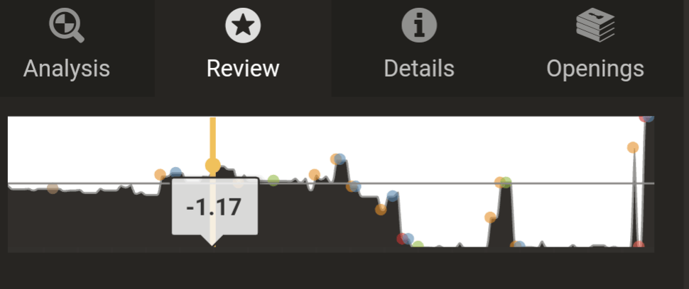
The graph will change based on the orientation of the board, with the default being from the perspective of the color you were playing. If you look at the mid-line and the color above/below that line will tell you who is ahead

For example, this graph is from black's perspective, and when black goes above the mid-line that means black has the advantage.

Avatar of harpvocal

Thanks. I know how to read the graph, but I appreciate it nonetheless. In your example I'll say that White started kicking ass. happy.png

Avatar of Martin_Stahl
harpvocal wrote:

Thanks. I know how to read the graph, but the new one has a different look. I'll get it and let you see.

That is the new graph, though I use Light UI so it's a little different.

Here is Dark UI , though it works the same.

Avatar of Martin_Stahl

This is the old one

Avatar of harpvocal

Yes, that's it. It's more pleasing to the eye and easier to understand. It's perfect, why change it?

Avatar of Martin_Stahl
harpvocal wrote:

Yes, that's it. It's more pleasing to the eye and easier to understand. It's perfect, why change it?

Not sure why it was changed. I preferred the old one but will get used to the newer version.

Avatar of RussBell

I don't care about whether I had the advantage 5-, 10-, 15-, or 20 moves ago, I care about NOW. Most of the real estate on the new graph is taken up presenting obsolete, useless information - which is simply distracting from the current situation.

This is another case of making a change to an app for the sake of making a change, and calling it an "improvement" or a new "feature", when in fact it is not better than what had existed previously.

Avatar of Paladin70

i agree, if it will be kept permentlly i will stop my membership here as this graph is unreadable. the old one was much better

Avatar of M1inho

You can't even see the color of the little circles anymore.. it's just sad and shoud be changeable in the options.

Avatar of KeSetoKaiba
Martin_Stahl wrote:
harpvocal wrote:

Yes, that's it. It's more pleasing to the eye and easier to understand. It's perfect, why change it?

Not sure why it was changed. I preferred the old one but will get used to the newer version.

I liked the older one too. The newer one is tough to visually see in comparison.

Avatar of Paladin70
KeSetoKaiba wrote:
Martin_Stahl wrote:
harpvocal wrote:

Yes, that's it. It's more pleasing to the eye and easier to understand. It's perfect, why change it?

Not sure why it was changed. I preferred the old one but will get used to the newer version.

I liked the older one too. The newer one is tough to visually see in comparison.

yes exactly i have no idea why they changed it what so ever. this combined with the fact they added the bad "miss" notation which isnt on the graph it just a straight up downgrade. if it will be like that as i said i will cancel my membership as i mainly use it for game analysis

Avatar of Gentleman_64

i feel like the staff got bored and decided to change something for no reason, not the first time they've done it. They are making tons of cash and don't have any work besides catching cheaters

Avatar of harpvocal

They're making tons of cash from people who think their new graph sucks.

Avatar of Paladin70

well not really since i am sure like myself many players who mainly buy membership for analysis will quit if this change stays on.

Avatar of Martin_Stahl
Gentleman_64 wrote:

i feel like the staff got bored and decided to change something for no reason, not the first time they've done it. They are making tons of cash and don't have any work besides catching cheaters

Staff don't just get bored and make changes. There are ideas/suggestions, planning, design mock ups, staff discussion. Then implementation, feedback, changes, and release.

Avatar of harpvocal

That makes it even more upsetting. happy.png

Avatar of krzaq2

+1 from me - this is incredibly illegible. After downgrading the game review feature I paid for, this is another change that makes me consider if my Plantium membership is actually worth it.

Avatar of Lord_Sweeney

What the hell is this? I came here to report this as a bug and it sounds like this new graph is SUPPOSED to look like that?!?! Who the hell was on meth when they made that decision? That is the fugliest thing I have ever seen. What a UI/UX disaster--high contrast does NOT make for a pleasing UI element.

Avatar of eyewashh

New graph is absolutely abysmal - really hope they change it back